Palos Verdes Art Center’s Studio School is an art education facility for students of all ages. Its new visual identity was created with the idea of highlighting the program’s inclusive values with its goal of teaching art fundamentals.
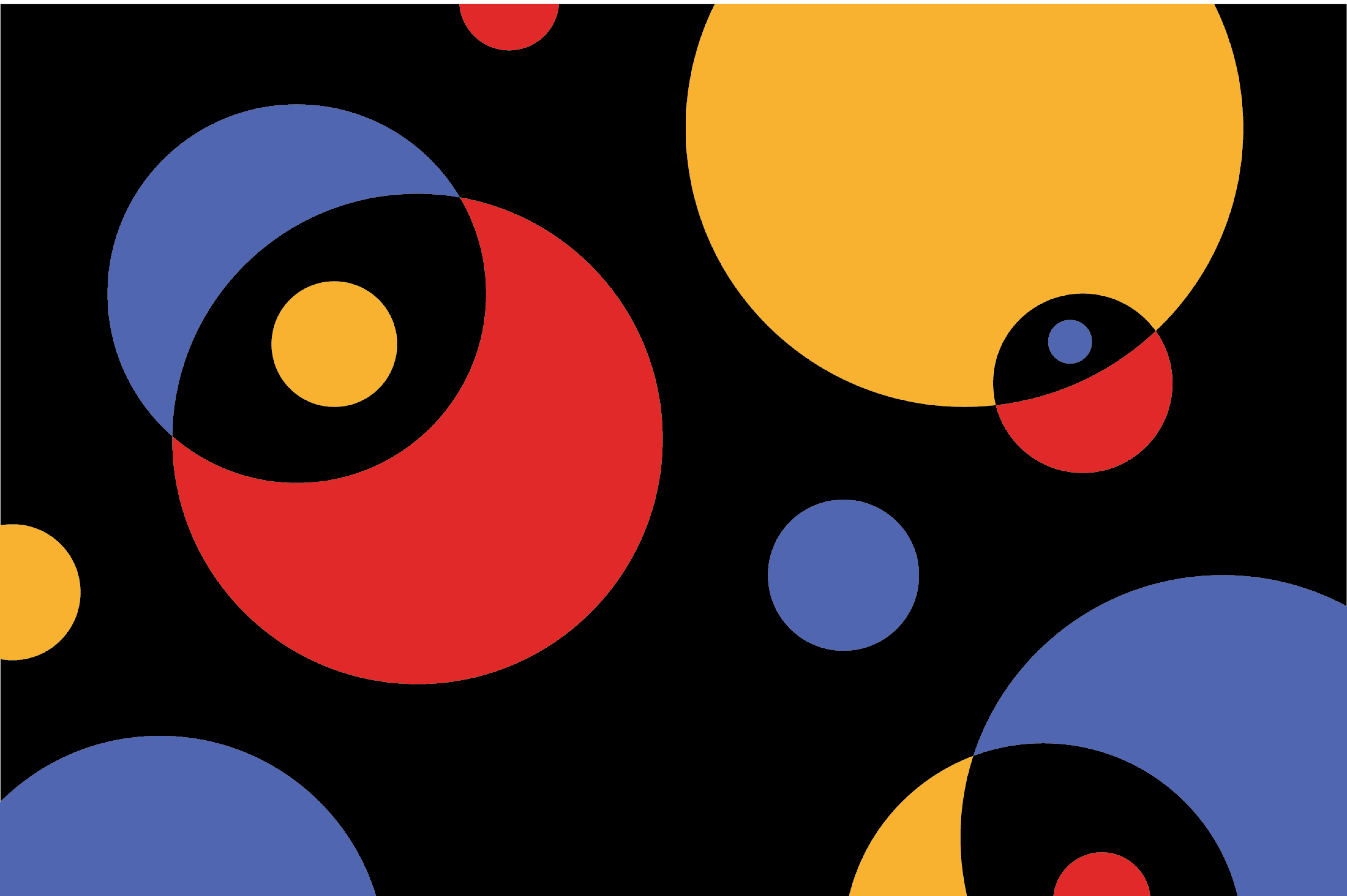
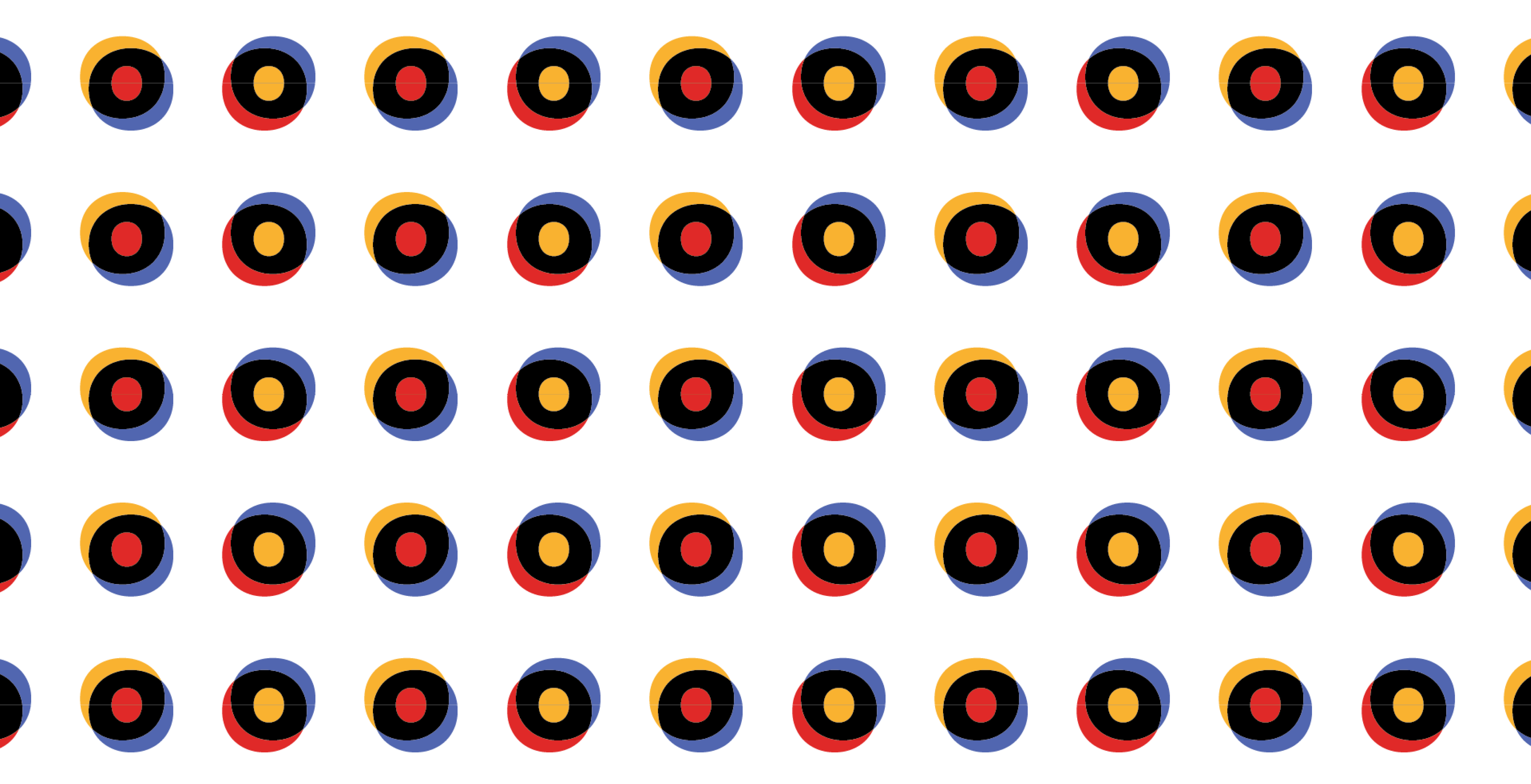
With the concepts of inclusion and education in mind, the main logo takes inspiration from the color wheel as a foundational art tool, and incorporates the gestalt design principle of closure to form an implied circle.
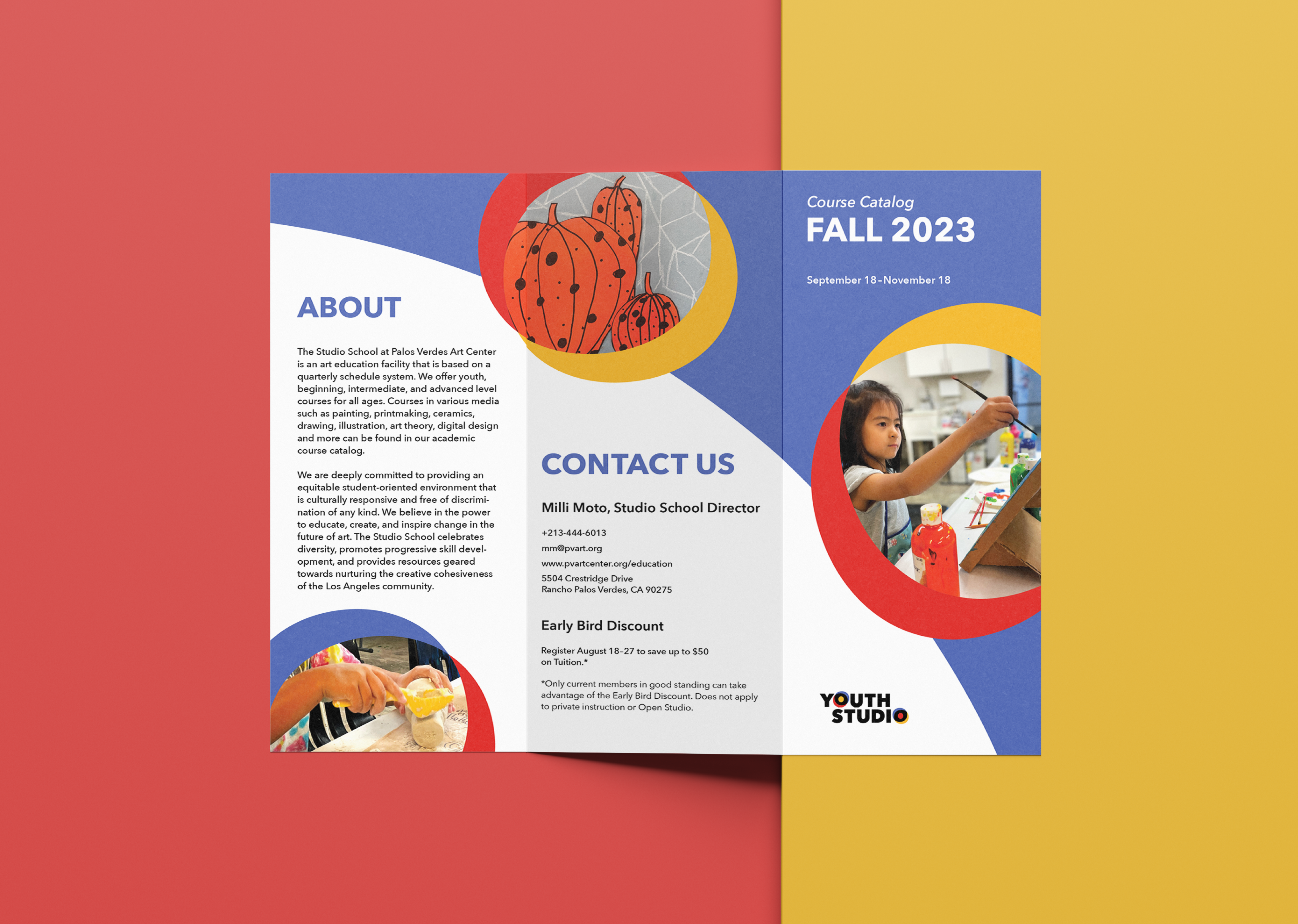
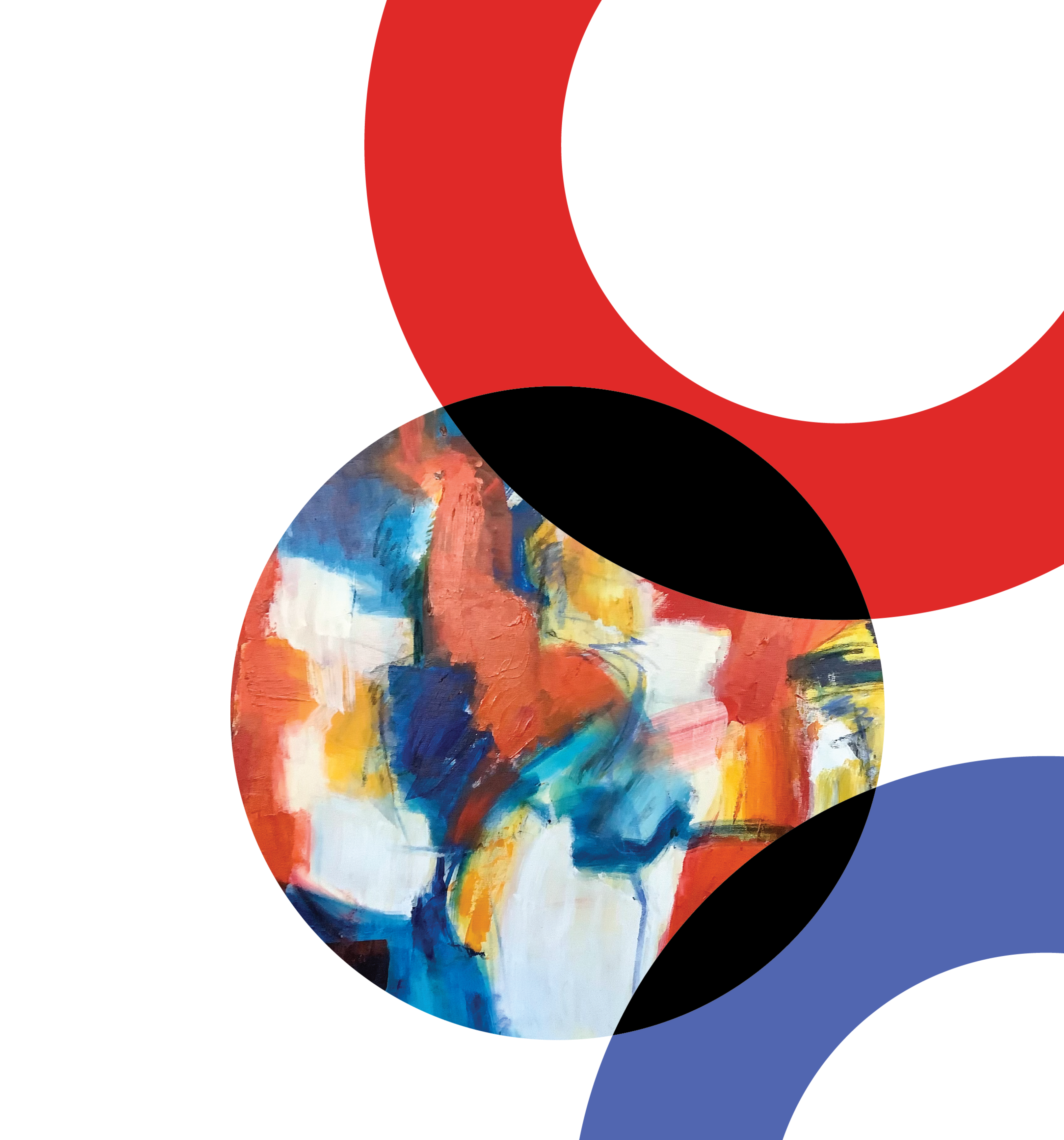
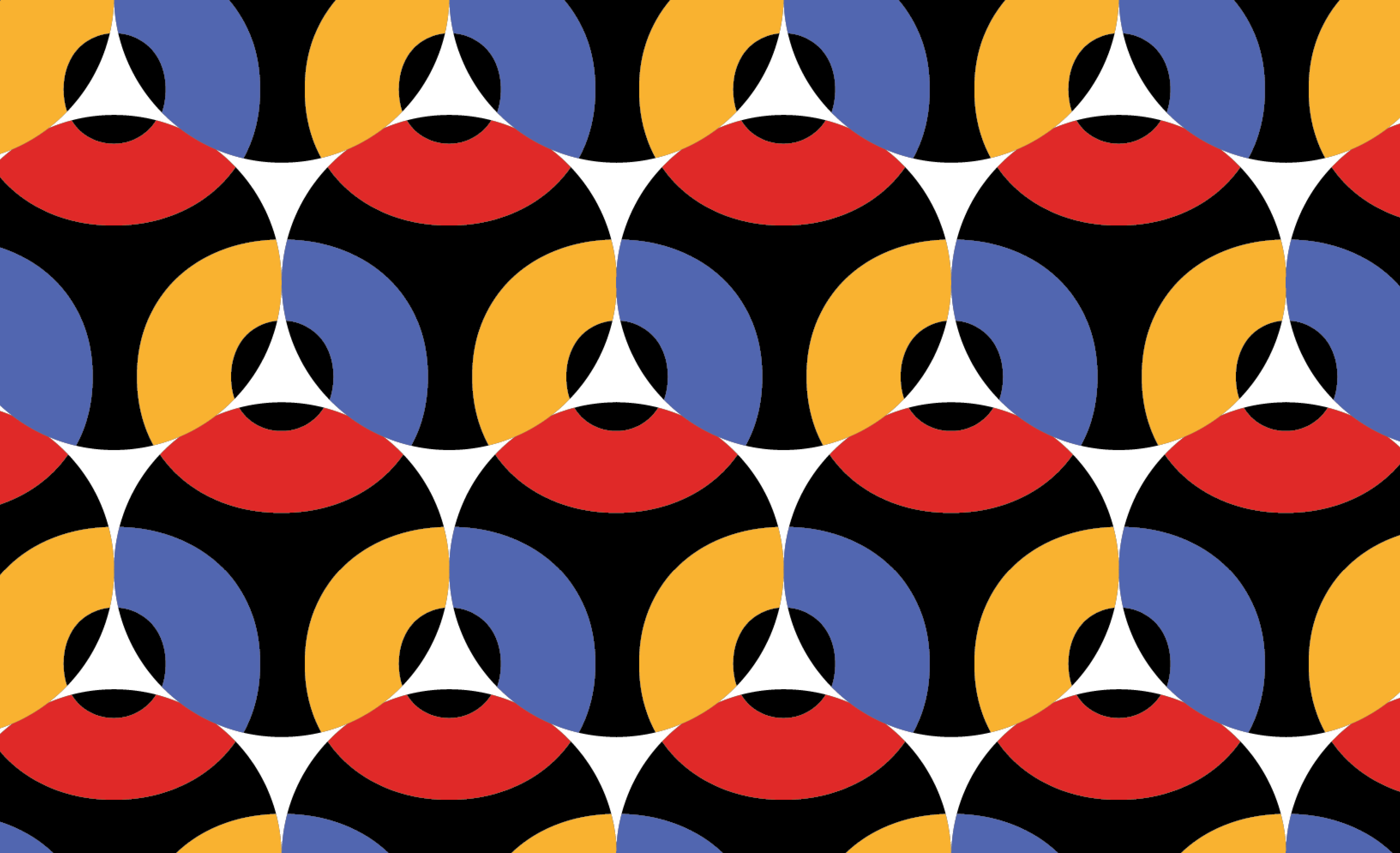
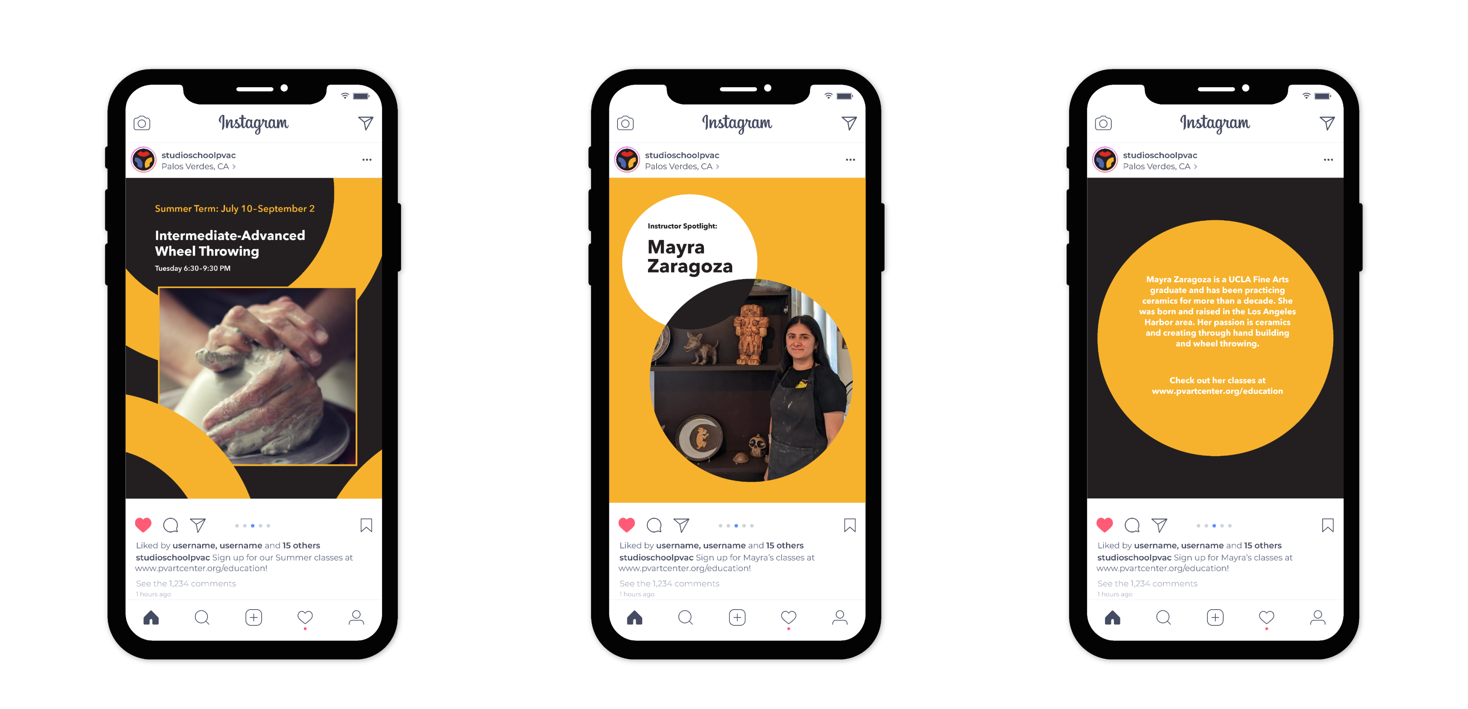
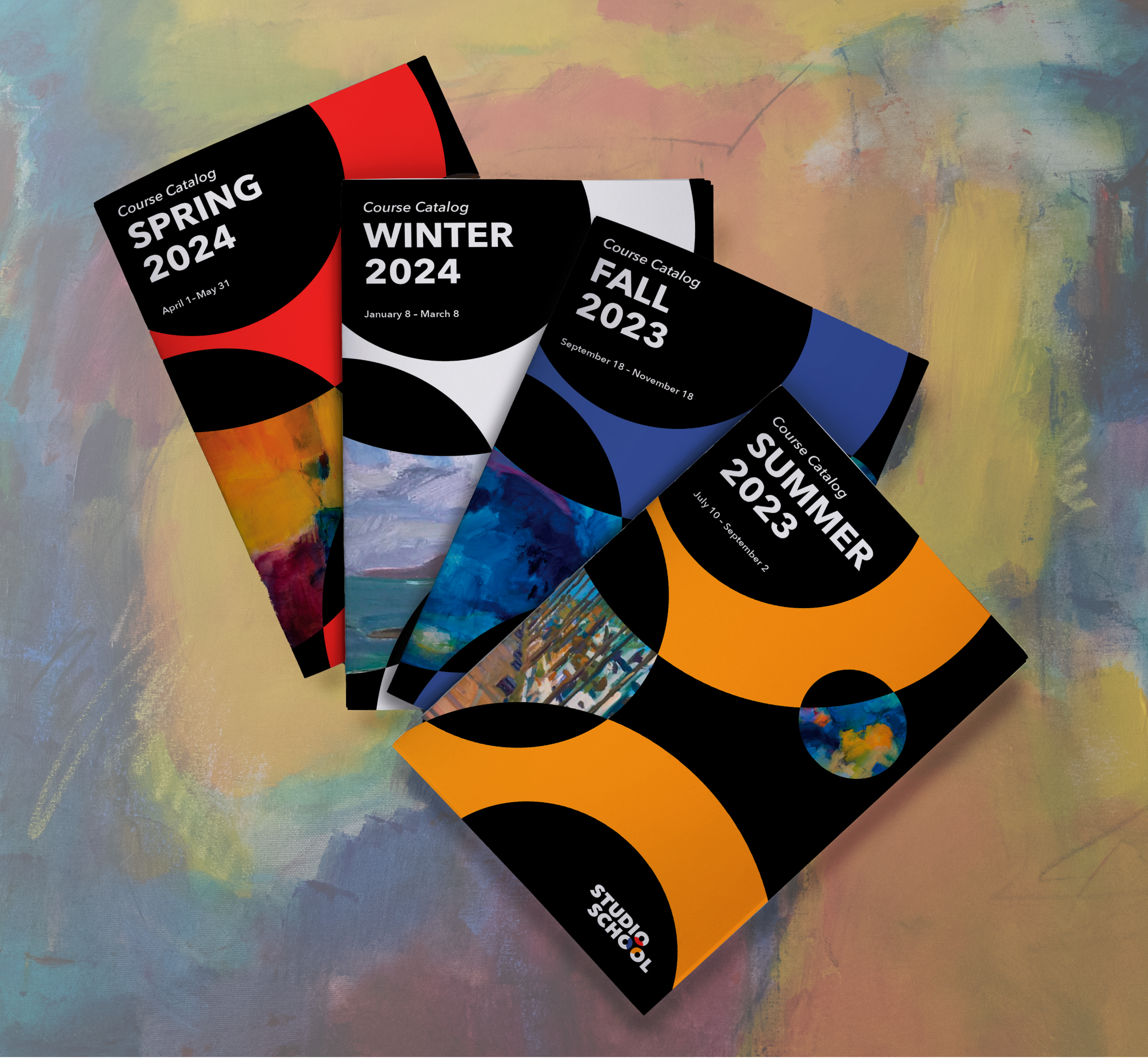
Using the logo as a jumping-off point, the additional branding elements incorporate similar arc-like shapes and overlapping forms. Using the idea of color-mixing as both a metaphor for creativity and cohesion, this idea extends throughout the brand applications.

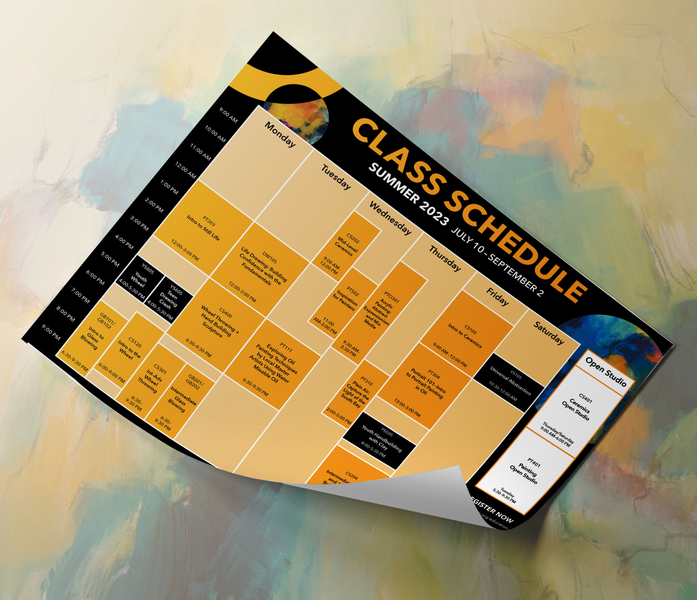
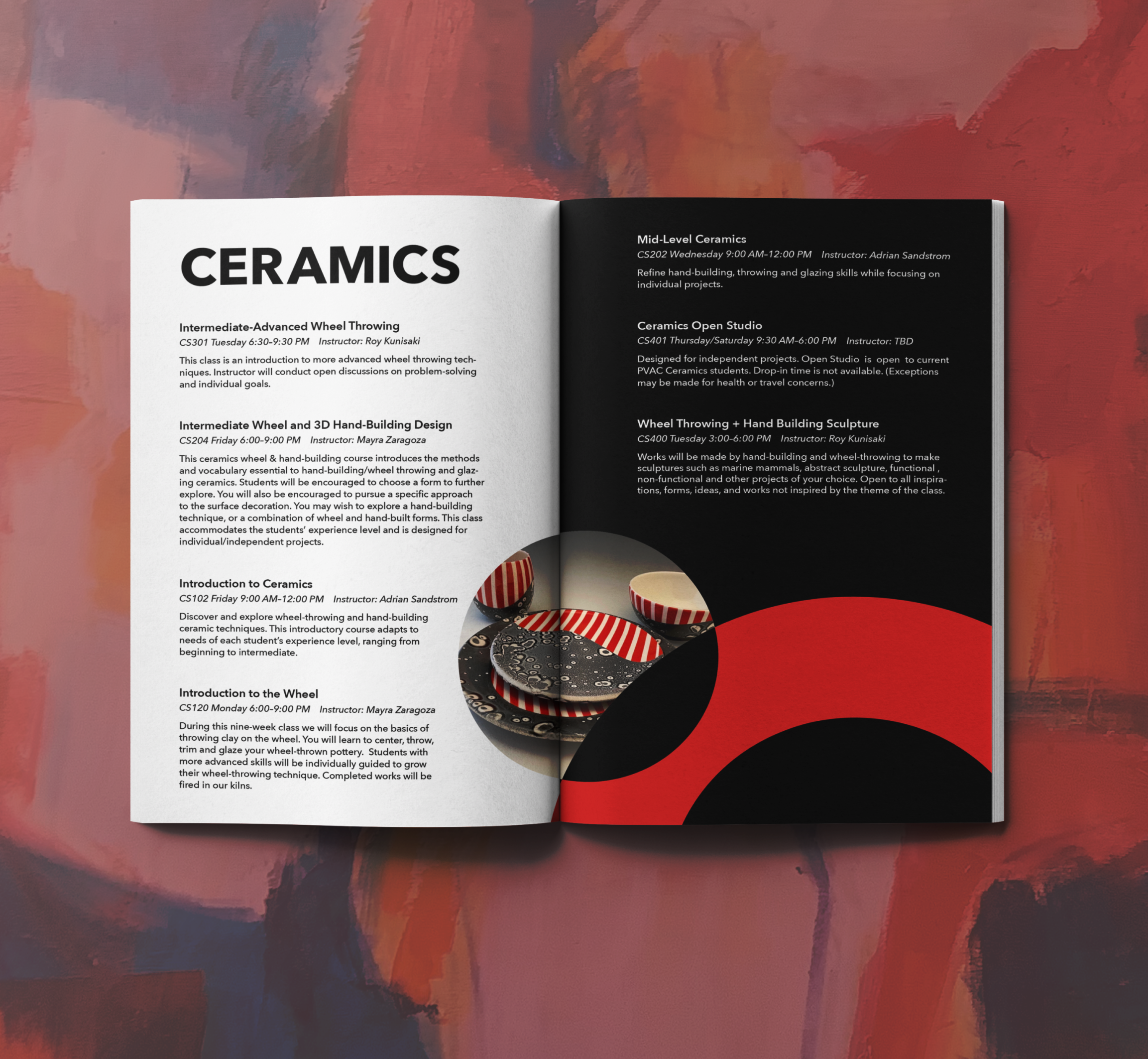
Because of the Studio School’s quarterly class schedule, the color palette is divided by season to give each new quarter a distinct look. These applications can be seen across the Studio School’s calendars, course catalogs, banners, and social media posts.

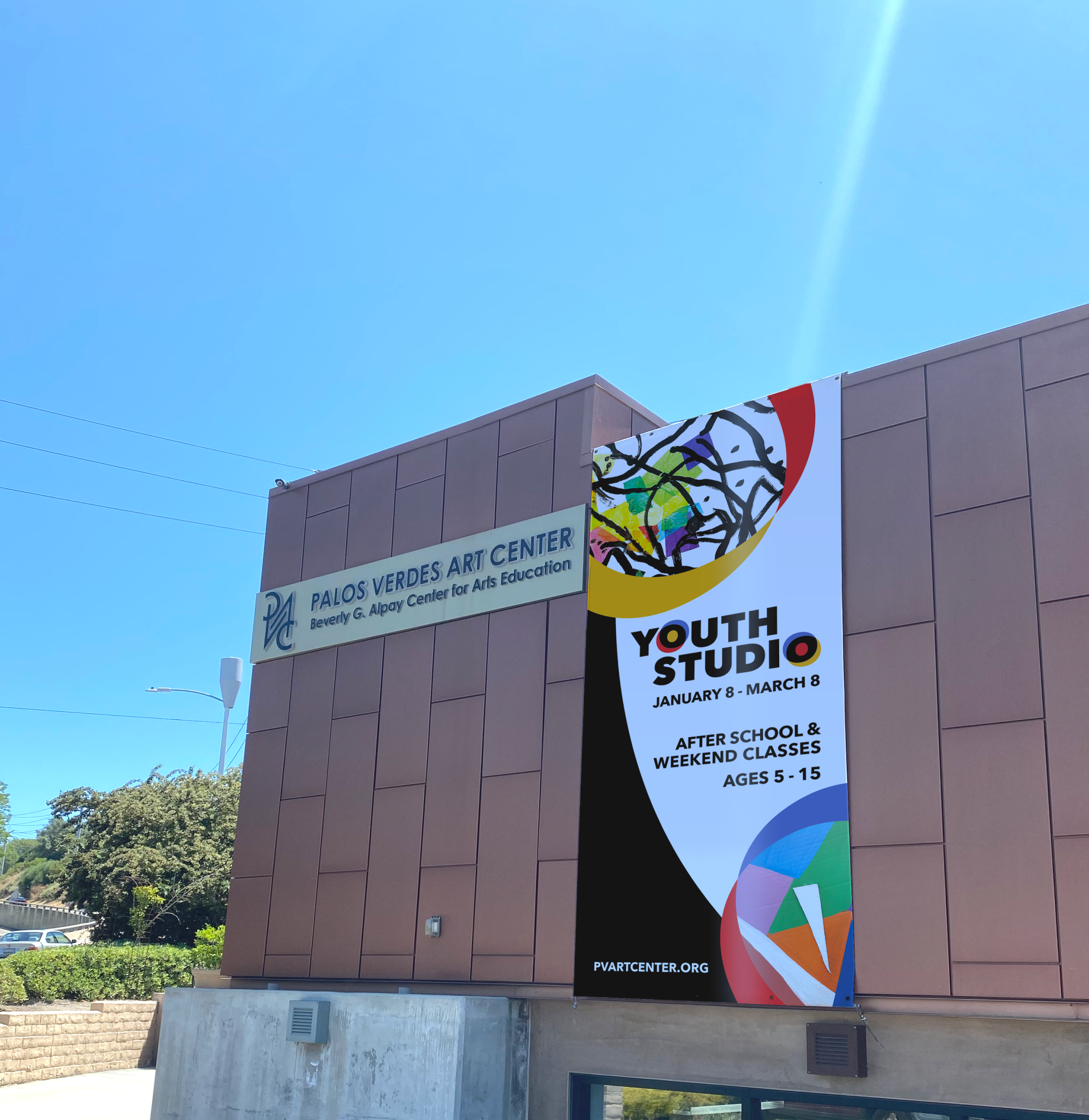
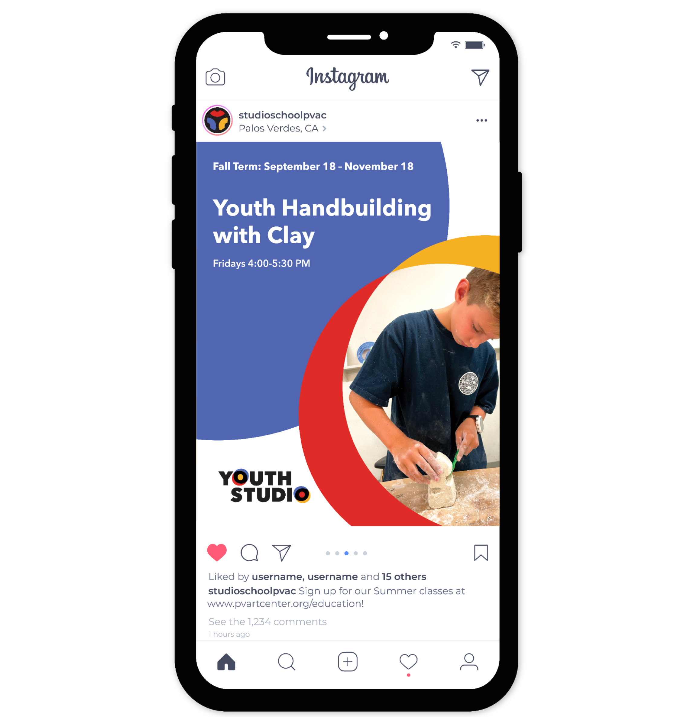
In addition to the branding for the Studio School, the Palos Verdes Art Center was also seeking a distinct but related visual identity for the Youth Studio, a subsection of the Studio School’s programming targeted towards young artists. The logo and applications borrow from the Studio School’s color palette and typeface while adding a more playful and youth-centered tone.