Perhaps one of the least-known and most distinct museums in Florence, the Opificio delle Pietre Dure (“Hard Stone Factory” in English) deserved a visual identity as strong and solid as its historical and cultural reputation.
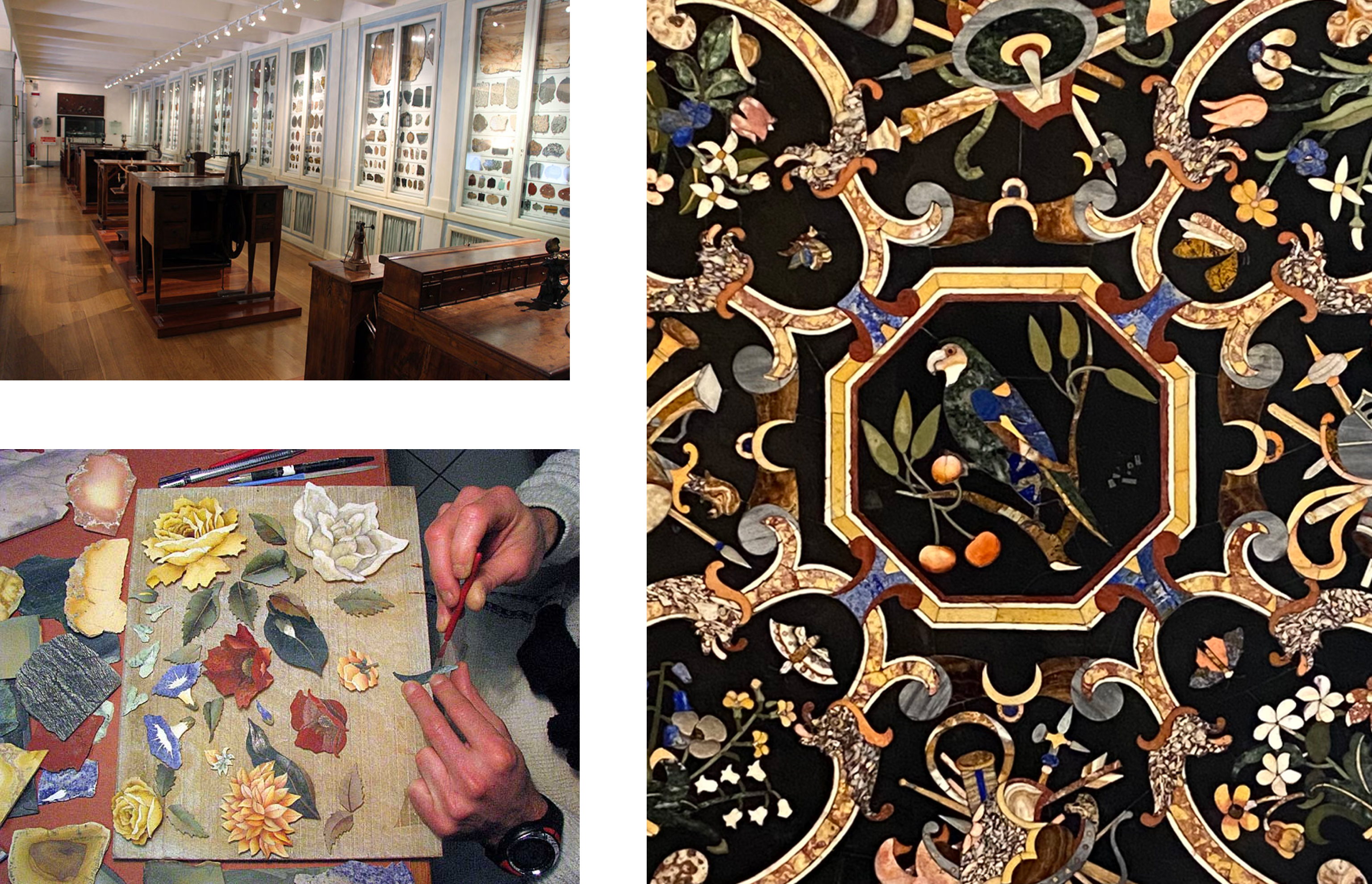
The Opificio delle Pietre Dure was initially founded by the Medici family in 1588 as a workshop for the creation of semi-precious stone artworks. Though it stopped producing these works with the death of the Medicis, they can still be seen on display within the museum.
The Opificio additionally functions as an art restoration center, and has played a role in restoring some of Florence’s most famous works of art.
With the Opificio delle Pietre Dure’s history and founding purpose in mind, the identity system was created to visually express the ideas of restoration and piecing-together that are represented across its different functions.
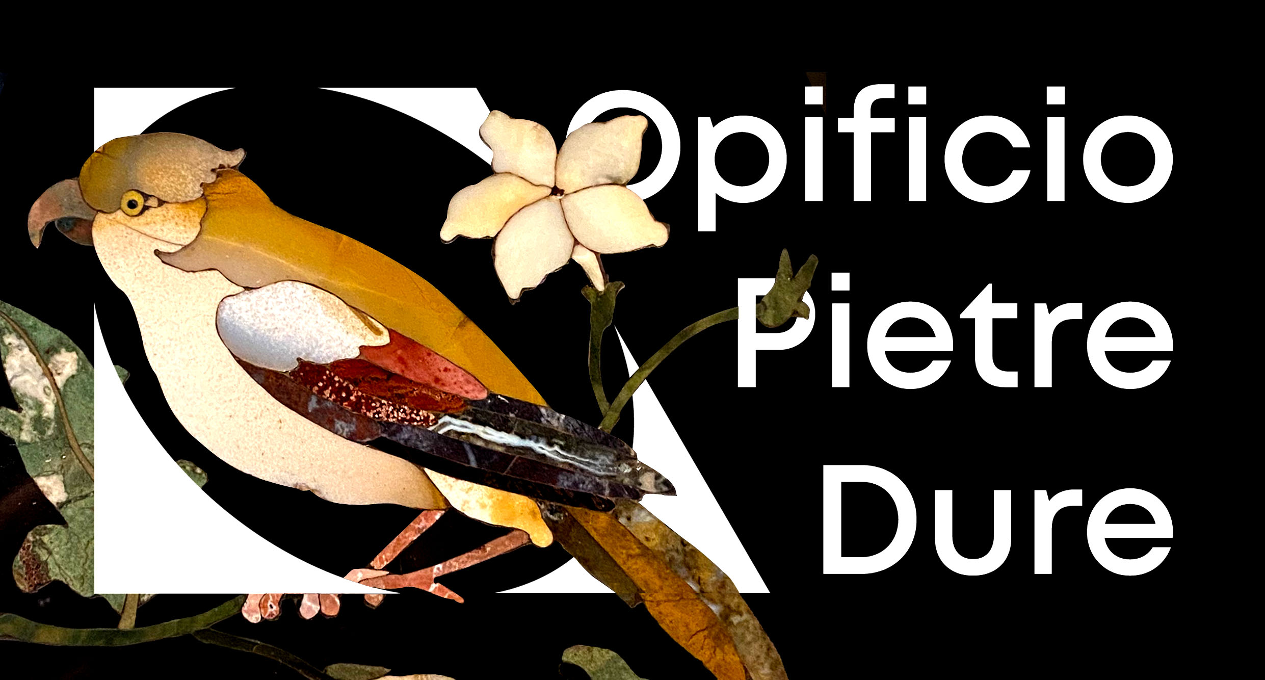
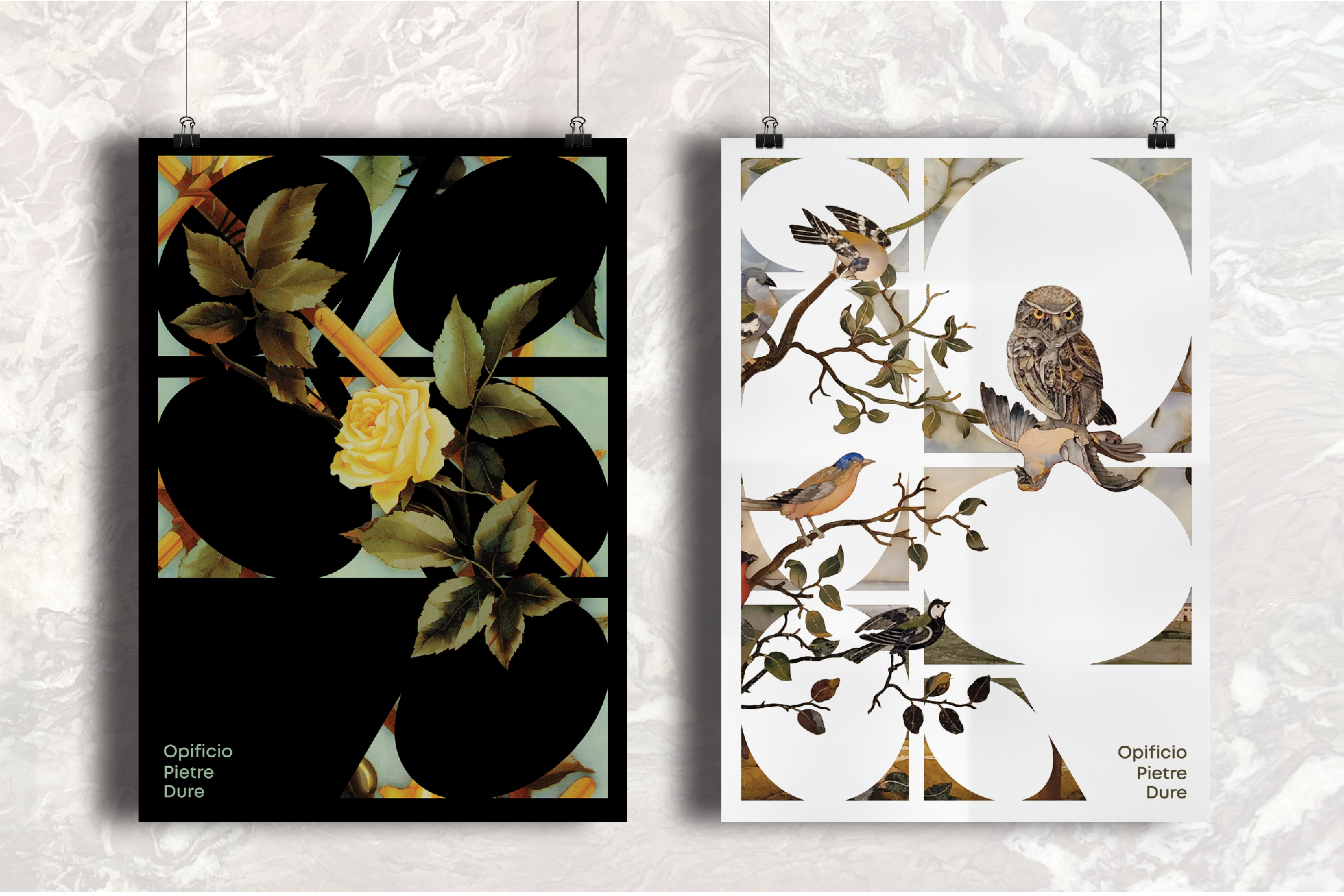
To reflect the puzzle-like process of creating semi-precious stone inlays, the logo was designed with variability in mind. Based on geometric forms found across the museum’s works, the logo consists of a 4-sided shape with an ellipse subtracted from its center. Along with the museum’s wordmark, the logo can be flipped or separated depending on its application
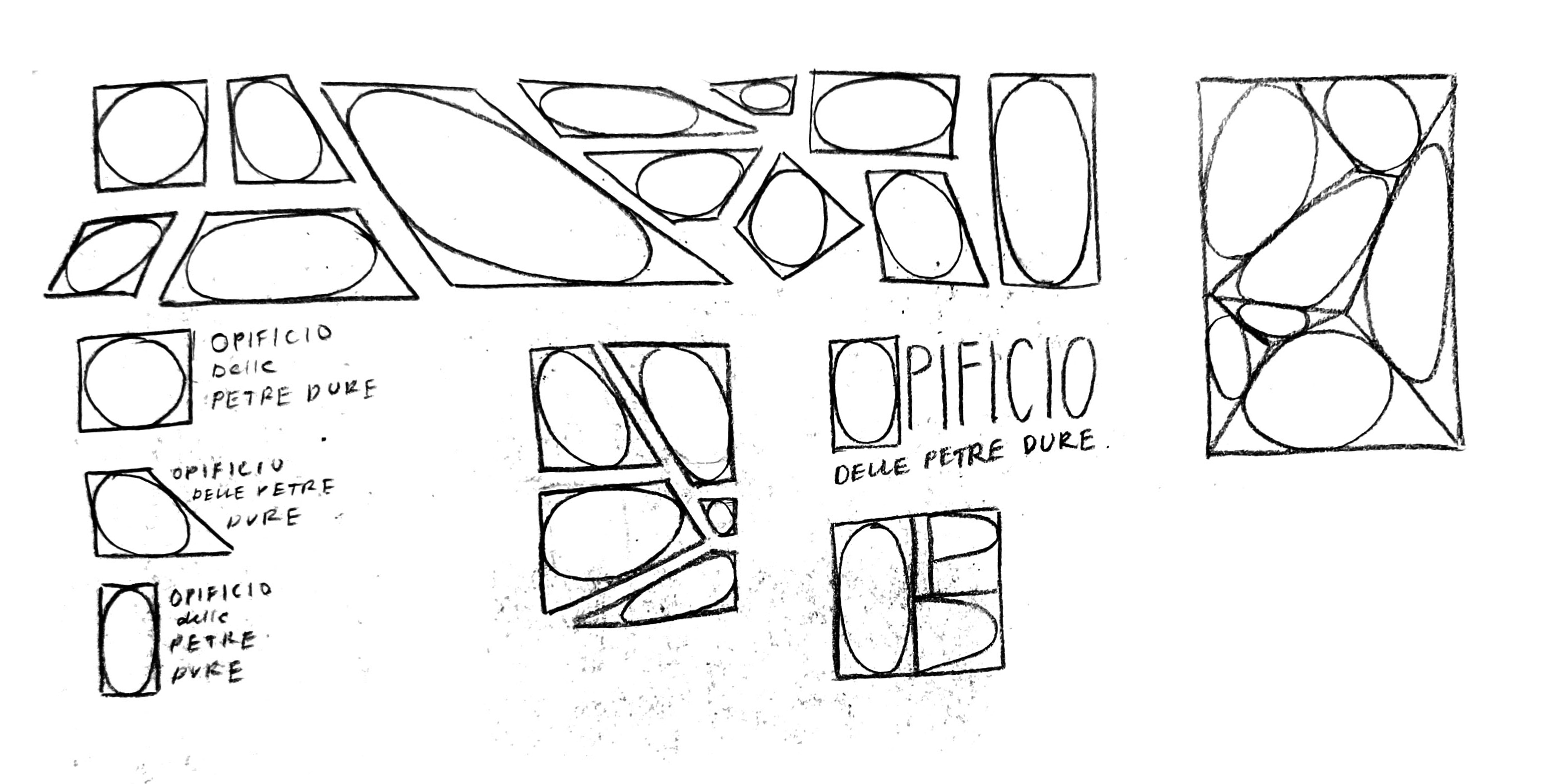
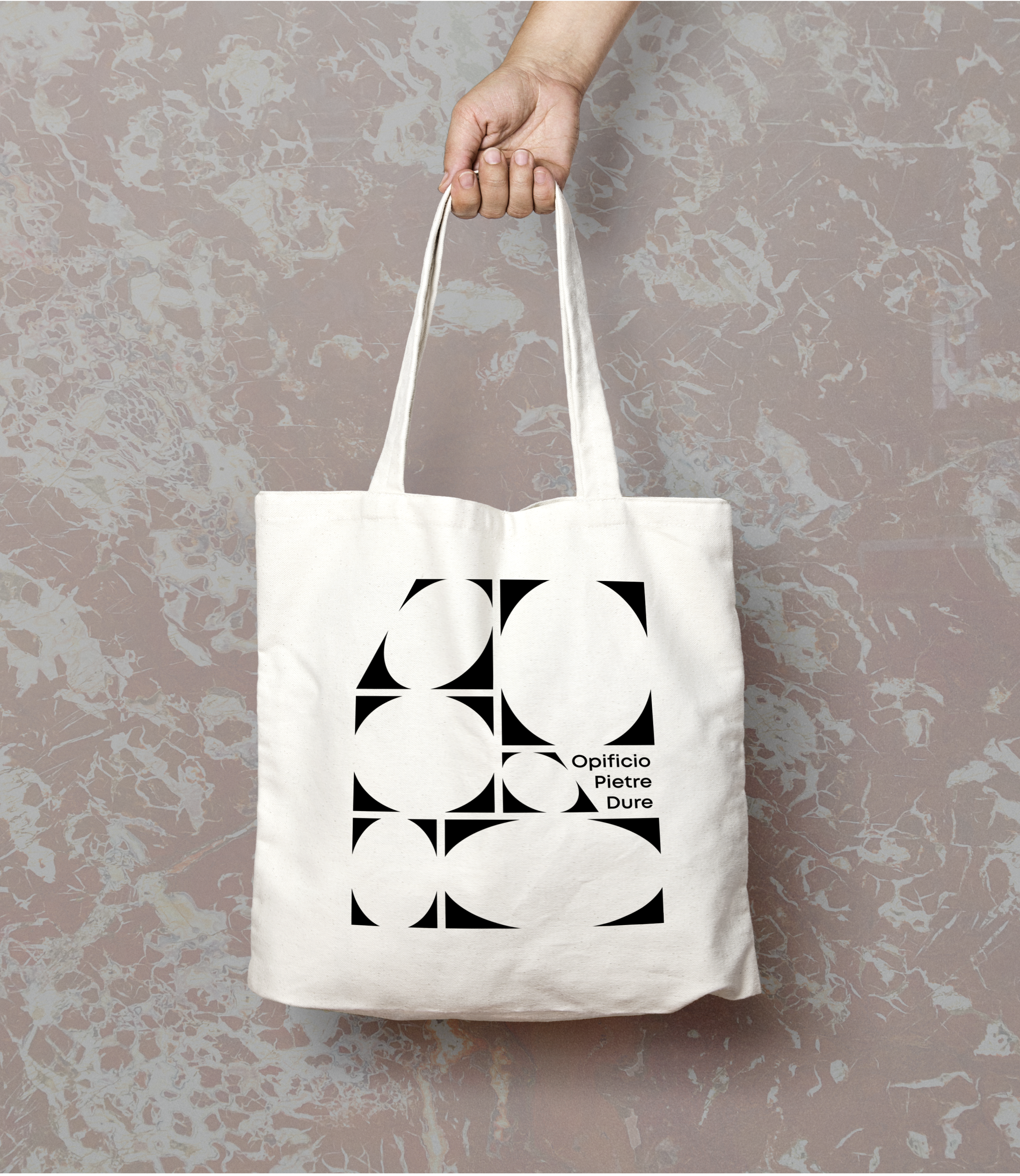
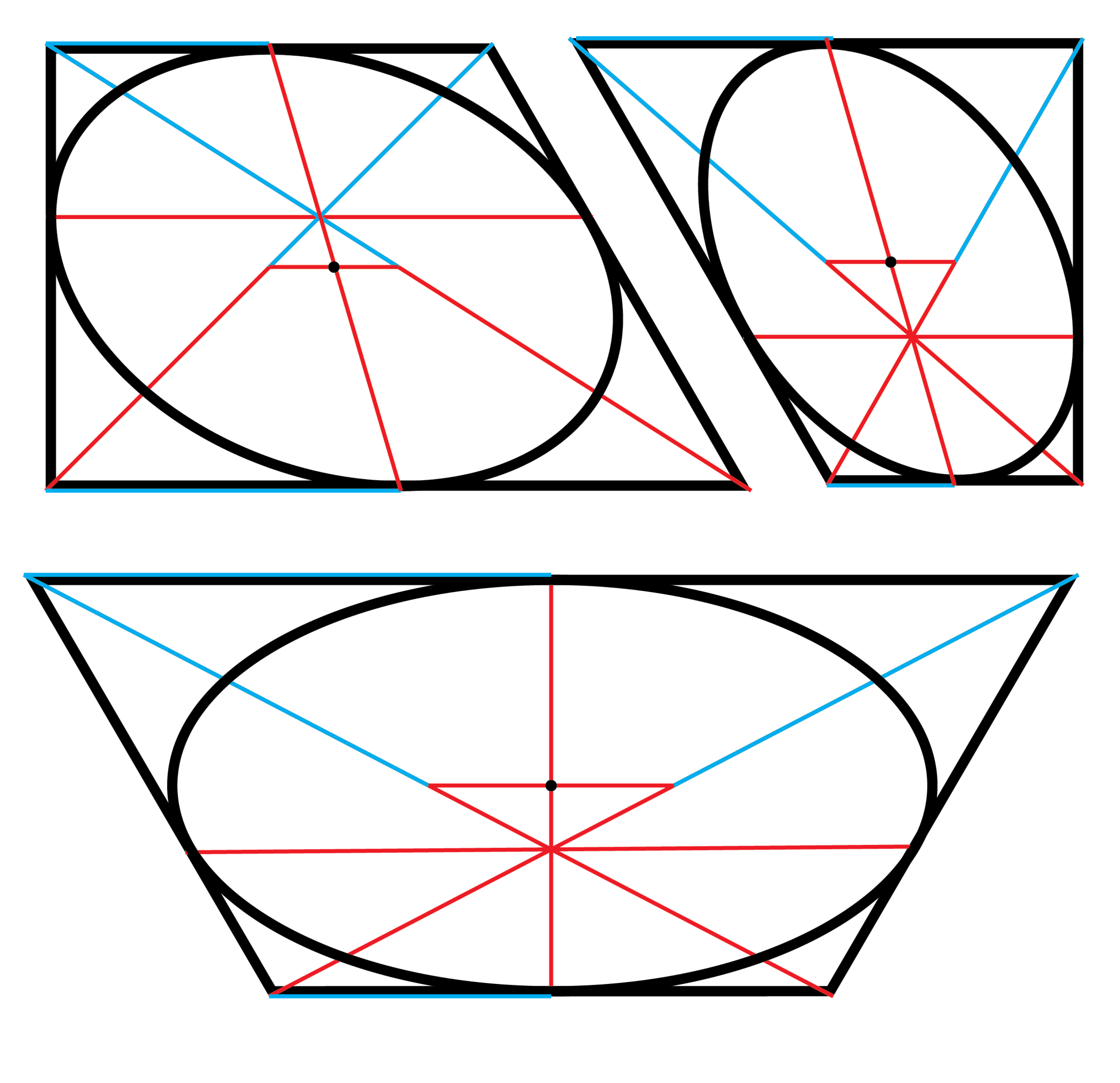
In order to maintain consistency in the system, the logo shape-variations were created so that the same visual treatment can be applied to any four-sided shape. Regardless of side-length or angle, each distinct shape contains its largest possible ellipse inscribed within it.
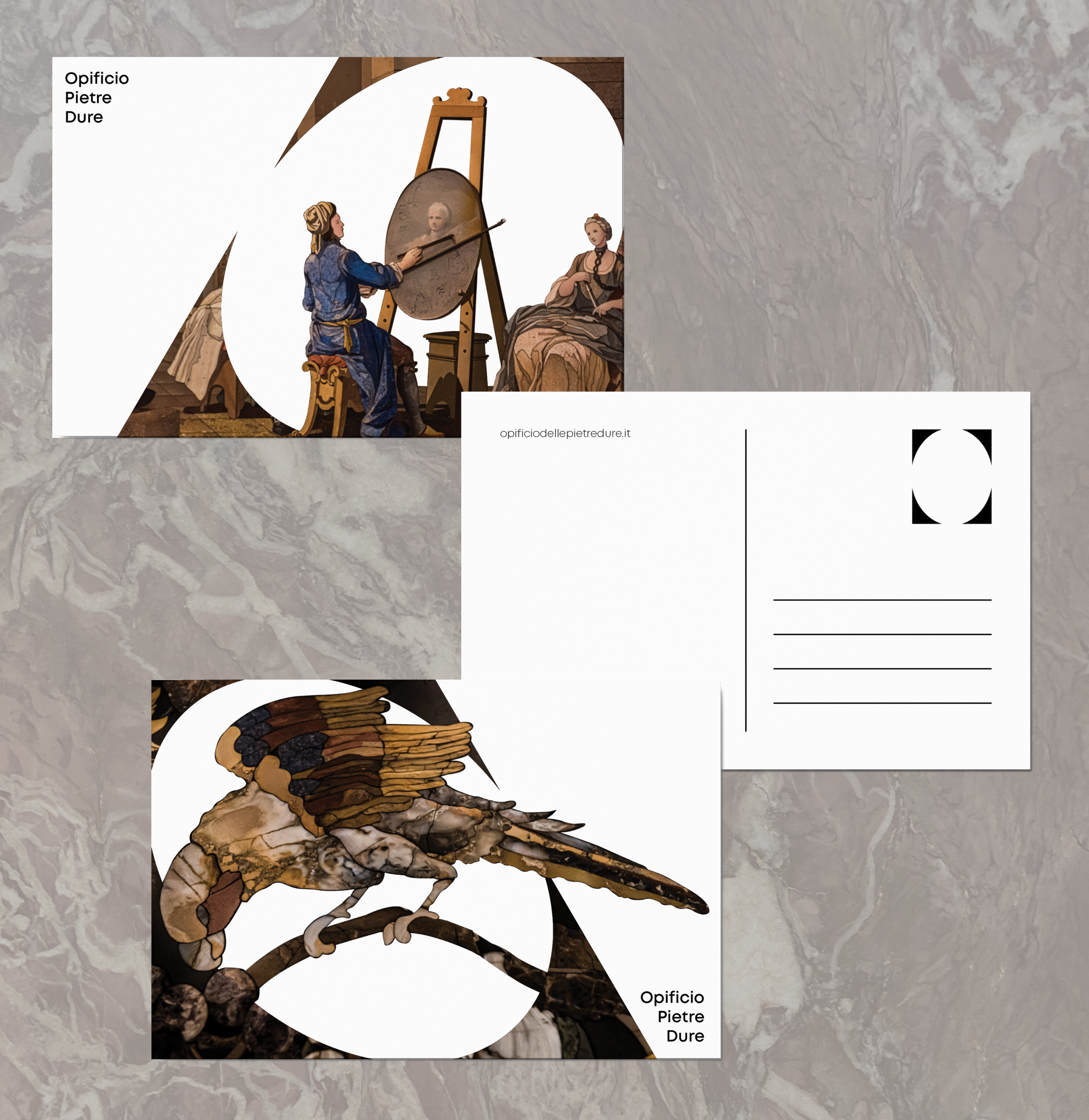
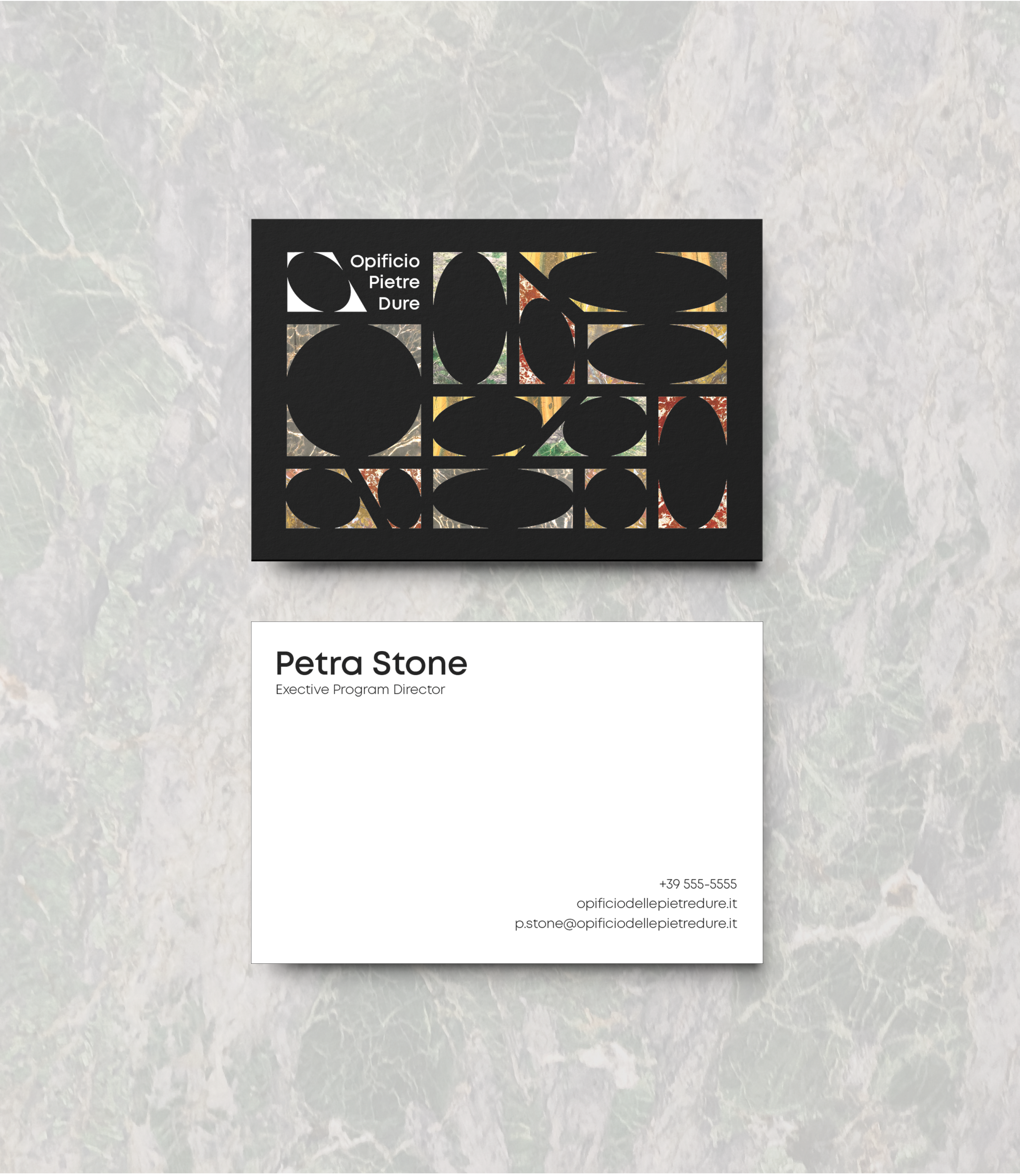
Applications of the branding systems involve integrating the logo with the works found in the museum. For materials like posters, postcards, tickets, and business cards, parts of the stone mosaics and textures from the semi-precious stones are applied to the logo and its pattern variations.

