Over the past three decades, Centaurus Financial has built a strong reputation as a company that delivers personalized wealth management solutions to its clients.
Distinguished by its status as an independent broker dealer, its individualized attention to clients, and its focus on loyalty and longevity, the company was in need of a consistent brand design system to capture its unique positioning and to legitimize its visual presence in the industry.
Centaurus Financial derives its name from the Centaurus constellation. The constellation, visible from the southern hemisphere, is said to depict the mythological figure Chiron, king of centaurs and a mentor to many of Greek mythology’s most notable heroes.
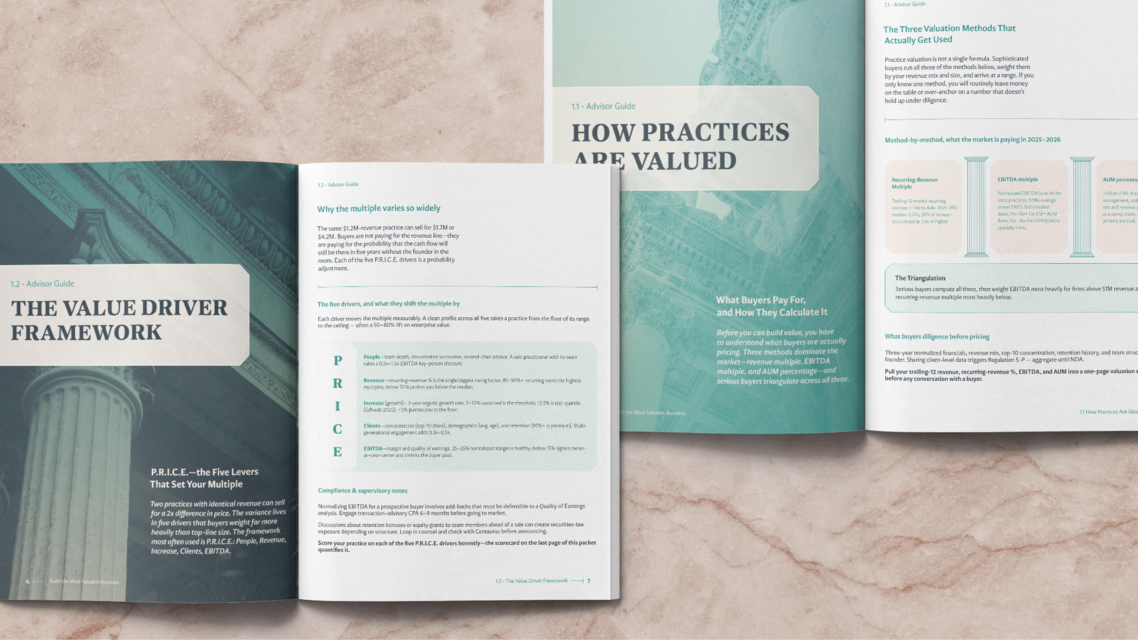
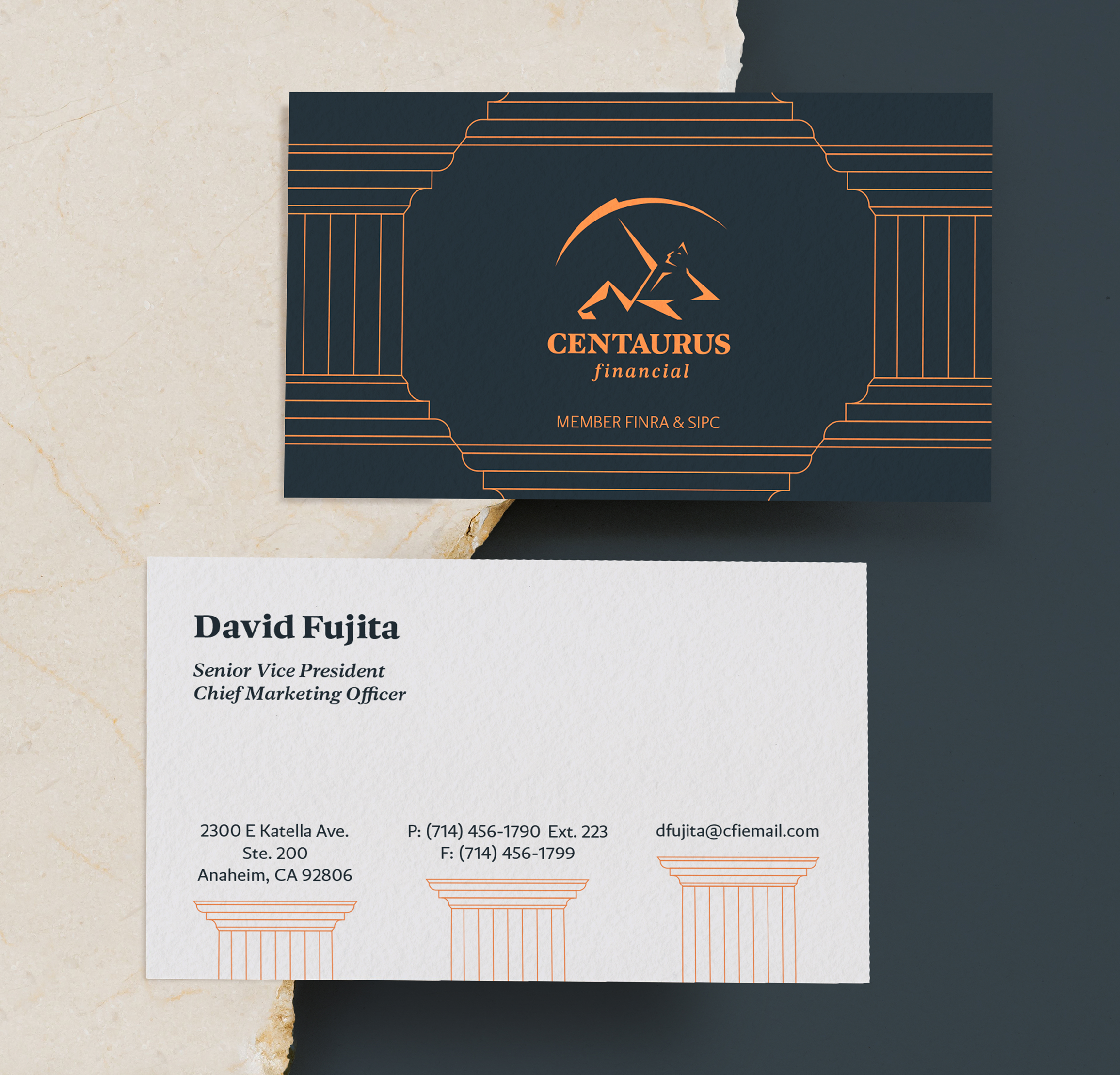
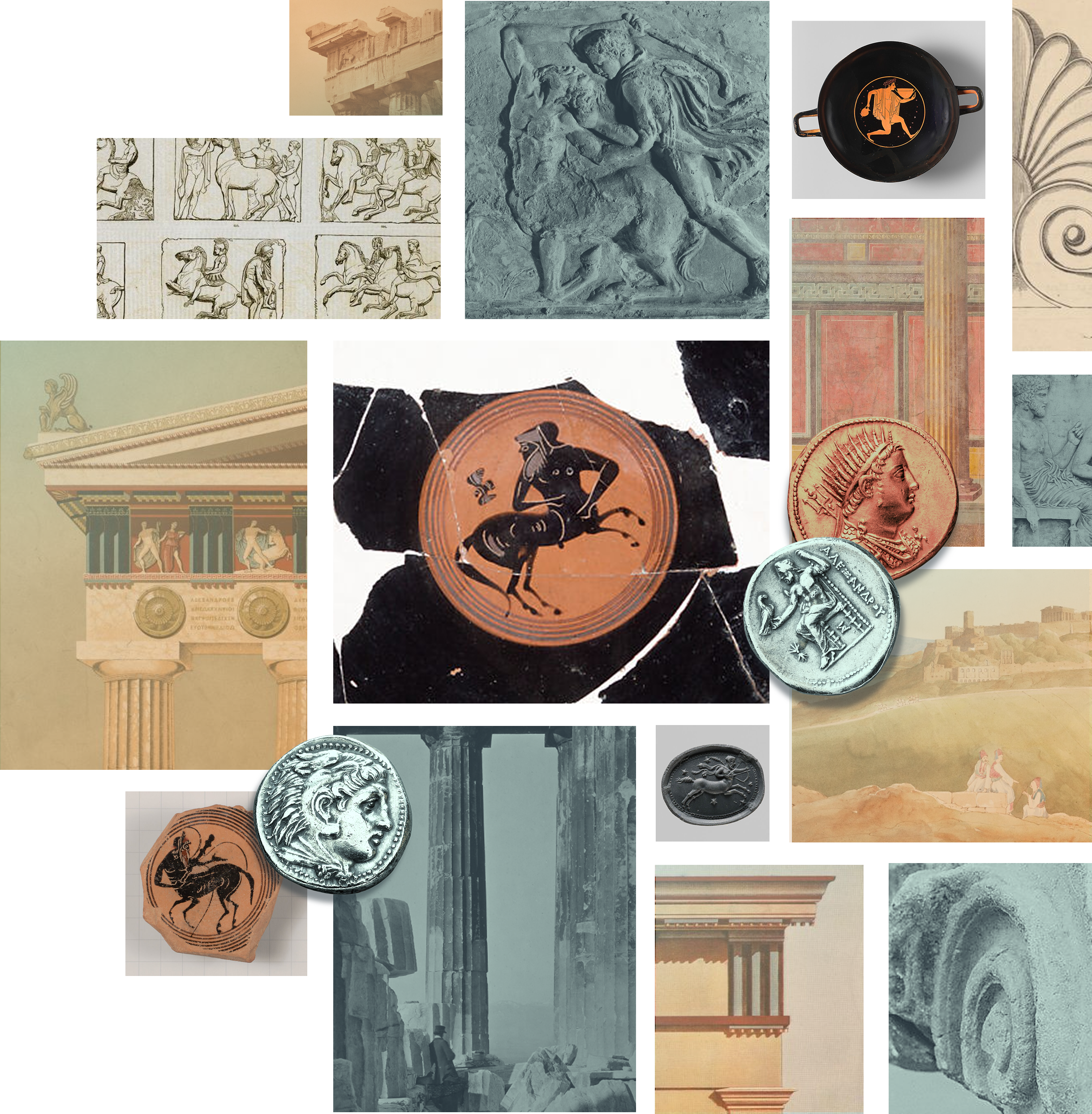
Consistent with the name’s classical origins, and coinciding with Centaurus’s 30-year milestone, the company’s new brand identity system was designed with strength, longevity, and lasting guidance as its ideological north star, incorporating elements of Greek antiquity into its many visual touch points.
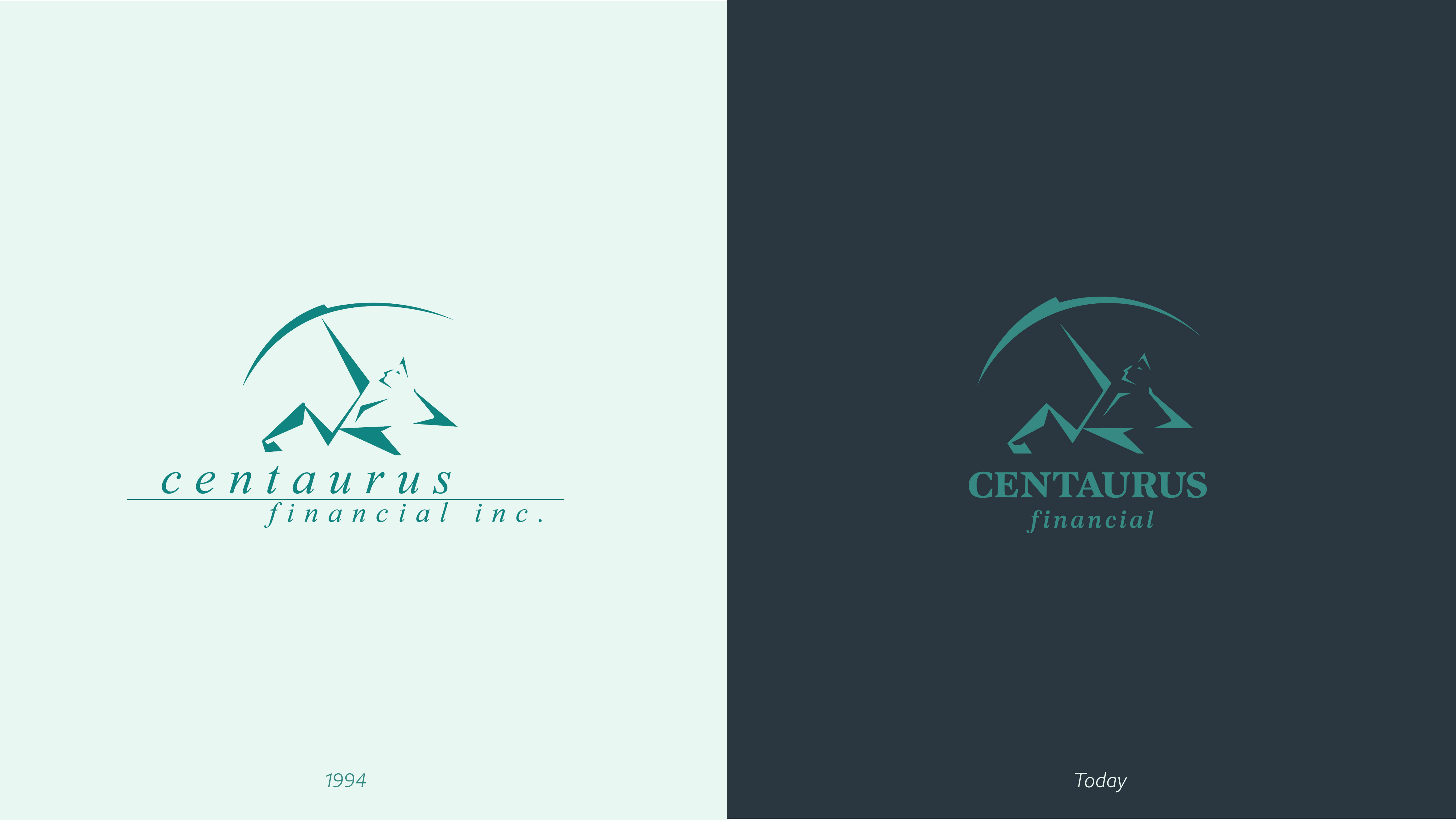
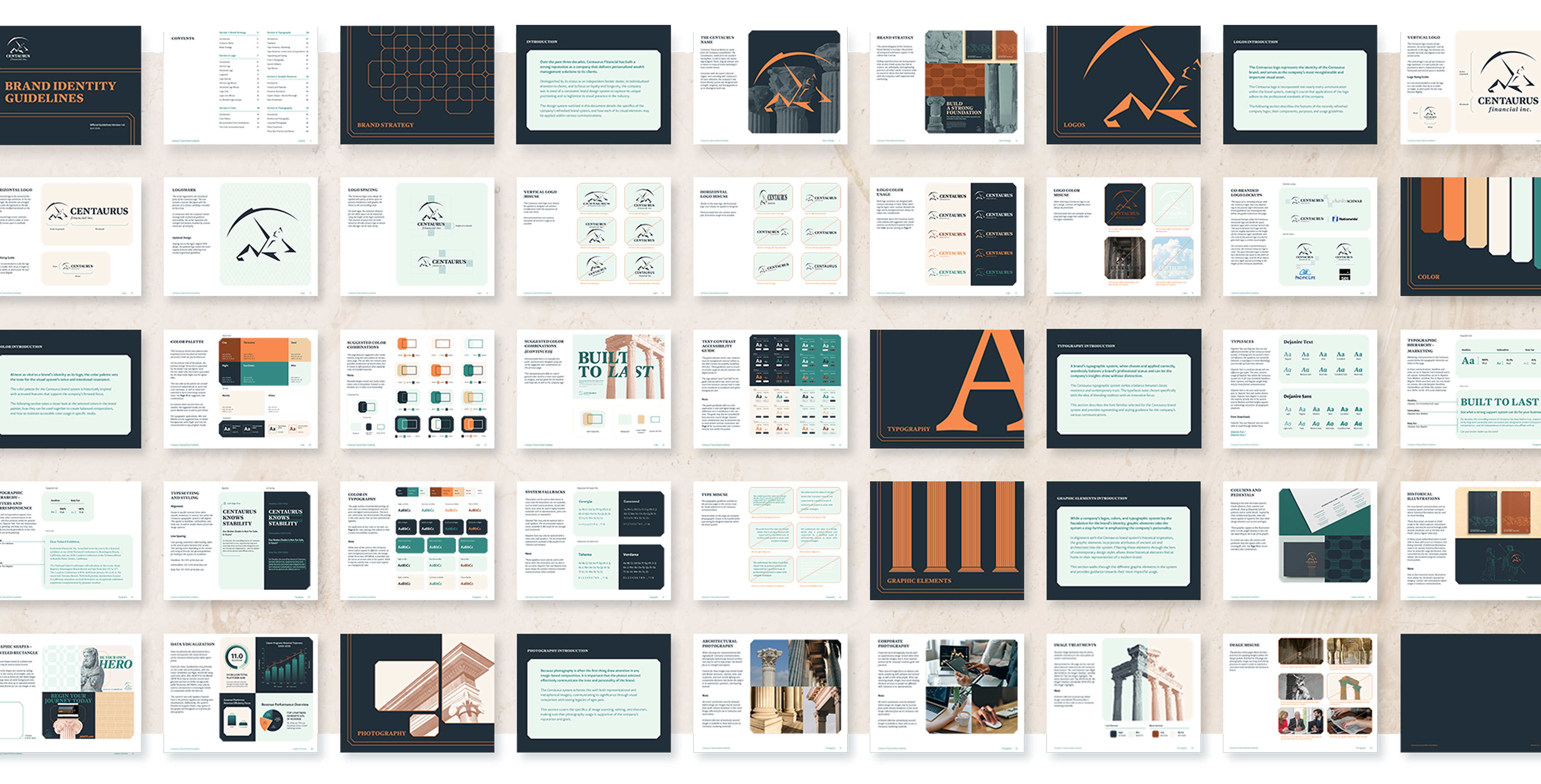
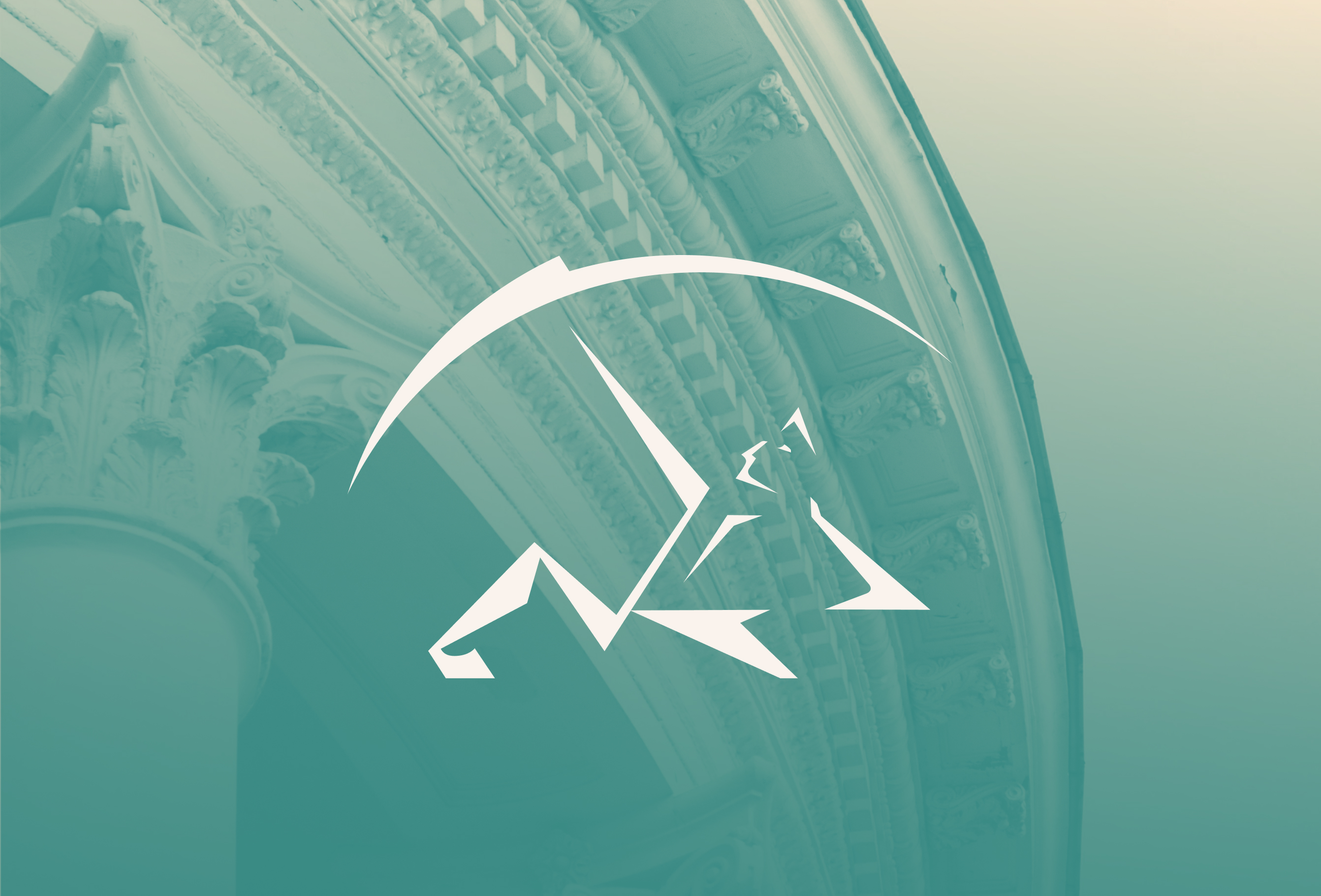
The archer logomark is the visual focal point of the Centaurus logo. The icon includes a human-like figure with the features of a centaur, wielding a rounded archery bow.
Staying true to the logo’s original 1994 design, the updated logomark retains the icon’s angular features while adhering more closely to geometric guidelines.
Additionally, the new logo suite features updated typographic treatments to accompany the broader changes of the brand refresh, as well as a horizontally configured logo option.