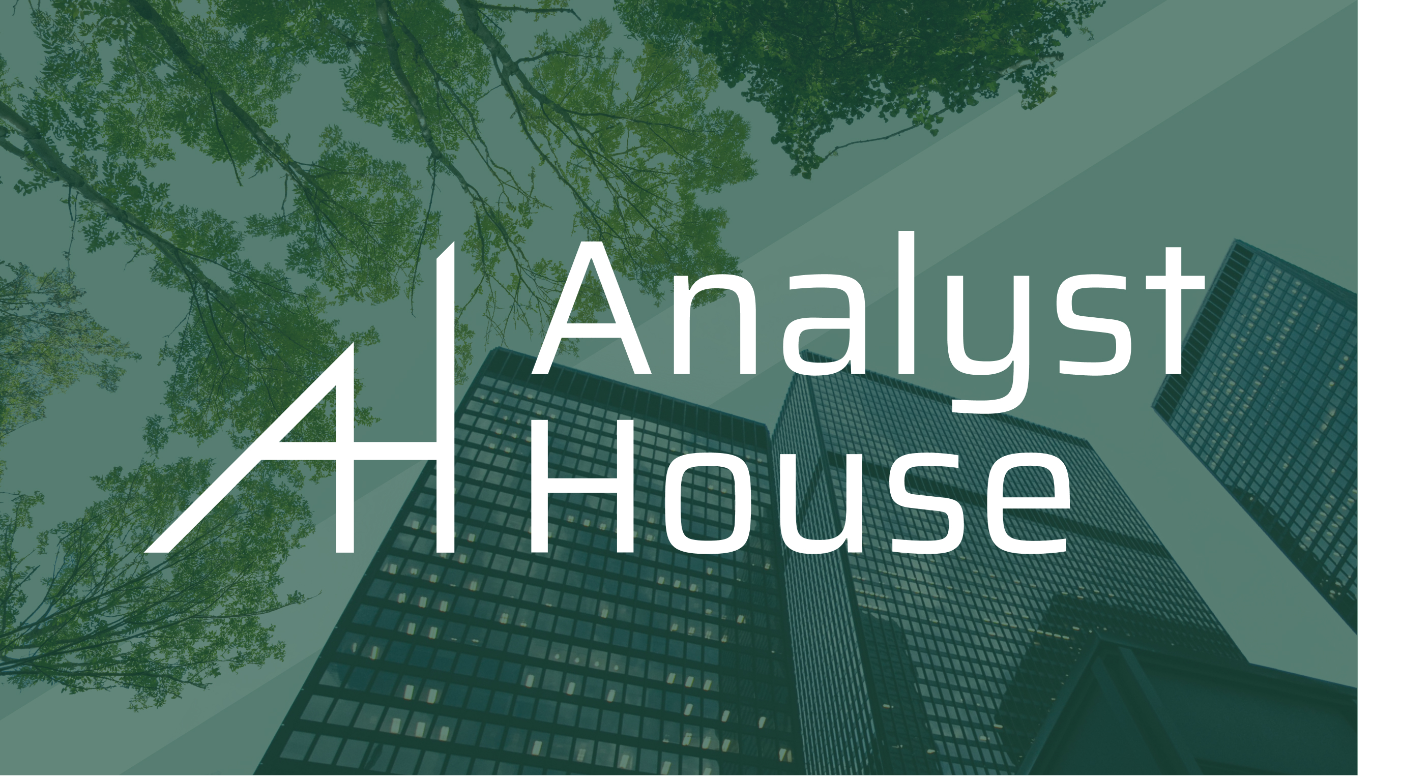
As a company focused on supporting the financial needs of growing startups, Analyst House needed a visual system with an approachable and tech-forward edge to set it apart from traditional firms. Its new identity system places the idea of growth at its center, connecting with the company’s goal of building businesses from the ground up.
The design of the logo and brand system began with a close examination of the company’s goals as a startup helping to launch other startups. The combination of the intellectual-sounding “Analyst” with the more friendly and cozy “House” served as a jumping-off point, as did the company’s emphasis on technology, sustainability, accessibility, and transparency.
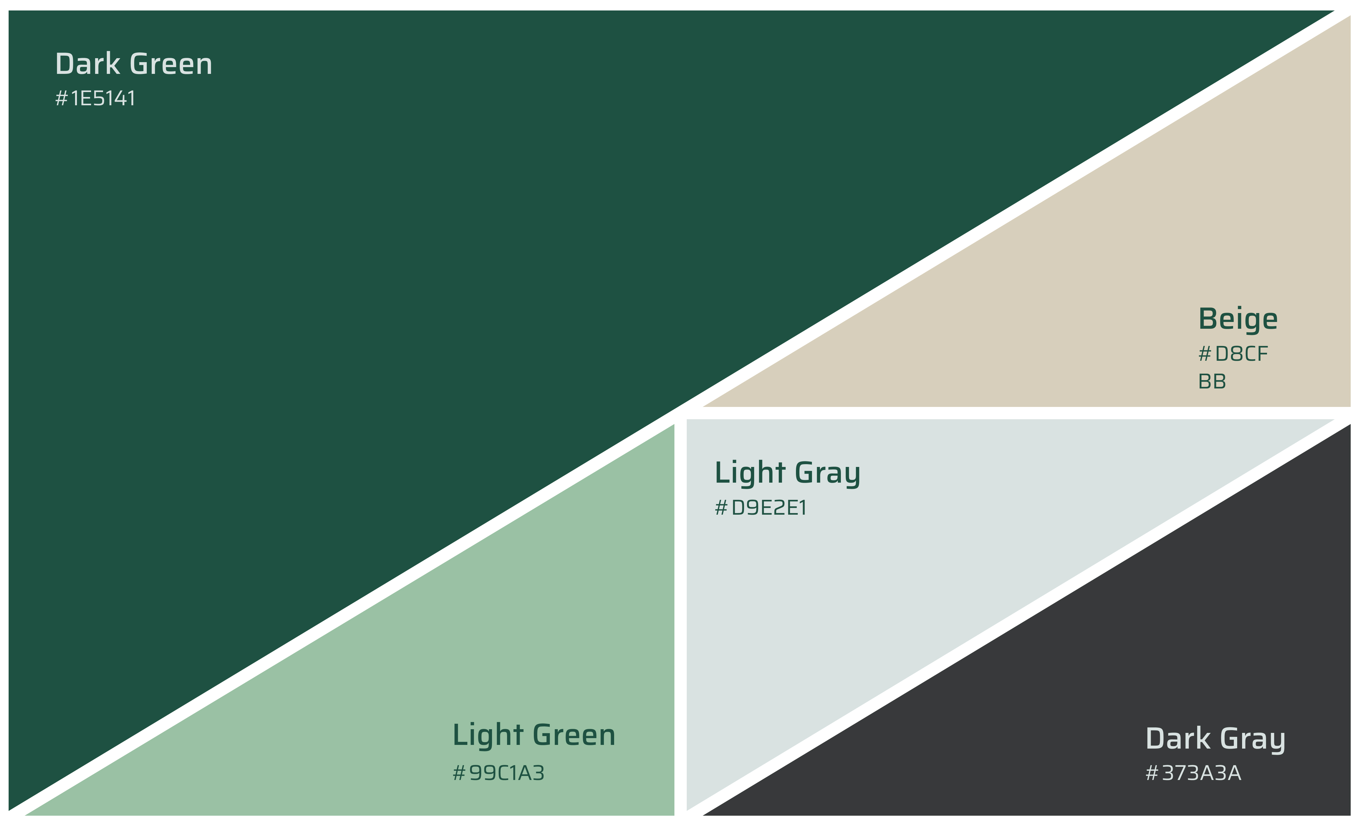
The final system grew out of a central metaphor of the company acting as a greenhouse: a warm, transparent, and (literally) green environment that helps new things grow, just as Analyst House does for its clients.
The idea of a greenhouse extended beyond the initial creation of the logo and into each element of the system. Graphics and icons were given a glass-like treatment, and the company’s color palette and image direction were selected to invite ideas of growth, cultivation, and support.